
In today’s Money Weekend…lost in the noise…data will set you free…comparing trading systems…and more…
I reckon the parable of the blind men and the elephant is a great metaphor for the troubles people have getting their heads around the realities of trading.
The emotional turmoil that people experience while trading is based on their propensity to focus on the moment-to-moment gyrations in their P+L rather than the bigger picture.
A few months of great trading results make them feel bulletproof and they extrapolate their success far into the future, certain they have cracked the code of the markets.
When the music stops and losses start building up, they flip into ruminating despair, kicking themselves for not taking more profits and for entering too many positions on the rally.
The trajectory of their P+L chart is quite literally a reflection or map of their state of mind. As long as the line is going up, they feel great, and when it is going down, they feel despondent.
Like the blind men feeling different parts of the elephant and feeling certain their description of the elephant is the right one, traders have trouble stepping back and seeing the whole.
The emotional roller coaster
|
|
| Source: Port Phillip Publishing |
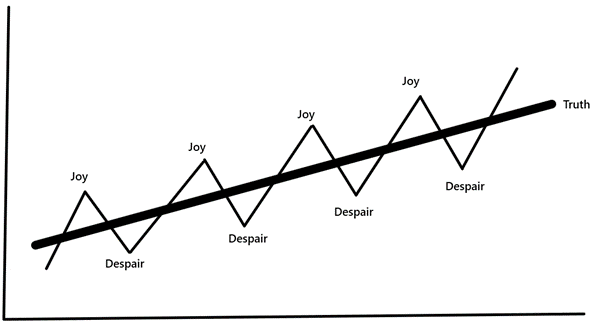
The line above marked ‘Truth’ is nowhere to be seen at any point along the journey for the trader that is caught up in each and every gyration in their P+L.
The overconfidence that builds during the joy phase is often the cause of the despair phase. The hit to confidence caused by the despair phase often causes that phase to last longer that it should.
It doesn’t take much for the ‘Truth’ line to flatten out and even head in the wrong direction.
Data will set you free
The only way the trader can pull themselves out of the roller coaster is to keep track of their ‘truth’ line.
They need to understand what their strike rate is over time and how much they are making on their winners and losing on their losers.
Even though those figures won’t be static, the longer you keep track of them, building a picture of what your figures are during different market cycles, the more confidence you will have to stay the course.
I don’t think many people really understand the difference in the trajectory of their P+L based on various strike rates and risk/reward.
Would you know if a trading system was good if I said it had a 45% strike rate and a 1:1.7 risk/reward? Ie: you make 1.7 times more on a winner than you lose on a loser.
How would you compare that to anything else out there? Does it just look like a bunch of numbers that make no sense?
Comparing trading systems
How about we have a look at an example that will give you a sense of how these things play out over time.
I’m going to compare the actual figures for the stock trading we have done at my trading service Retirement Trader since inception to a hypothetical strike rate that should make sense to you.
The chart I show you below isn’t a chronological record of the actual trading in Retirement Trader. It is a representation of the actual strike rate and risk/reward attained since inception in late 2018 up until 18 May 2021.
The figures that Retirement Trader has had since inception trading Australian stocks is a 60% strike rate with a 1:2.77 risk/reward. Ie: on average we have made nearly three times as much on a winner than we lose on a loser.
I will compare it to a trading system that has a 50% strike rate and a 1:2 risk/reward.
The simple way to explain the system above is that you make $1,000 on a trade and then lose $500 on the next trade, rinse, repeat.
How would the two strategies compare over time?
Let’s have a look.
|
|
| Source: Port Phillip Publishing |
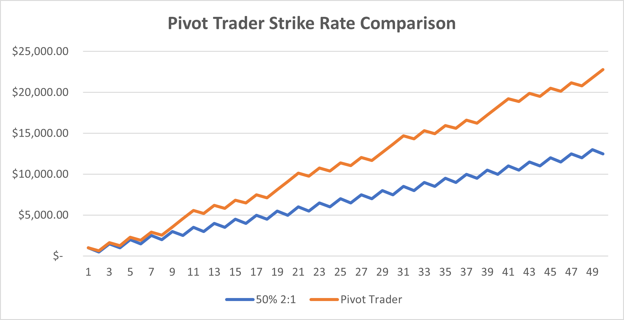
In the chart above, I have assumed you make $1,000 on a winning trade for each example. Therefore, each loss for Retirement Trader was $360, which gives the risk/reward of 1:2.77.
After 50 trades the system with a 50% strike rate has a profit of $12,500, whereas the Retirement Trader example would have made $22,800 or nearly double the other system.
So, a slight lift in strike rate and risk/reward has a huge effect on outcomes over time.
And it should be remembered that attaining a 50% strike rate and making twice as much on your winners is a great strategy outcome in itself. It’s easier said than done and many traders shoot for numbers that are similar to the hypothetical system I compared Retirement Trader to above.
It’s imperative for novice investors and traders to keep track of their data over time and create charts of their P+L like those above, to help them step back from the noise and focus on the big picture.
It is tempting to ignore the data if you think the story it will tell is not to your liking. But if there is resistance to finding out the truth behind the data, it is a huge warning sign that that is exactly what you must do.
If you’d like to learn more about how I have achieved the above figures over the past few years, including through the COVID crash, then please check out the free presentation I recently made with Woody.
You will see live examples of trades we have done in Retirement Trader, and I will explain the risk management process that I follow that is the key to creating great trading stats.
Regards,
 |
Murray Dawes,
Editor, Money Morning
PS: Click the thumbnail below to watch the pilot in a new weekly series I’m testing out called ‘The Closing Bell’, where I review what’s gone on in the ASX each week.

