
‘There can be few fields of human endeavour in which history counts for so little as in the world of finance. Past experience, to the extent that it is part of memory at all, is dismissed as the primitive refuge of those who do not have the insight to appreciate the incredible wonders of the present.’
– John Kenneth Galbraith ‘A Short History of Financial Euphoria’
When it comes to markets, our collective memories tend to be short.
In November 2008 (two months after Lehman Brothers busted), The Wall Street Journal published its post mortem on the US Housing Bubble.
To quote…
‘When it comes to booms gone bust, ‘over-investment and over-speculation are often important; but they would have far less serious results were they not conducted with borrowed money.’
What did we learn from the worst economic crisis since The Great Depression?
Absolutely nothing. The lesson has been completely ignored.
Debt levels have never been higher
To quote from last week’s The Daily Reckoning Australia…
‘This chart should have you quaking with fear
‘The last time the US 10-year bond rate was around the 4.7% level was in late 2007…just before the GFC.
‘The difference between then and now?
‘An additional US$44 trillion (that’s 44,000 billion dollars) has been added to the US debt pile.
|
|
| Source: FRED |
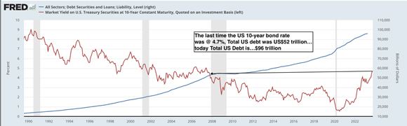
‘Wow. The worst financial and economic crisis since The Great Depression was triggered by a debt load that was a little over half of what it is today…and, everything is ok?
‘Have we collectively lost our senses?
‘That’s a rhetorical question.’
We have just lived through a prolonged period of ‘over-investment and over-speculation’ caused by excessive levels of borrowing and expect it to end without serious consequences?
That’s insanity writ large.
We have lived in a bubble for 40 years
For the vast majority of us, our adult lives have been lived through the most extraordinary period in history.
Our lived experience has been one of share markets in the ascendency…be patient, higher highs are coming.
We have lived in an asset bubble for 40 years.
But that has not always been so…
|
|
| Source: MacroTrends |
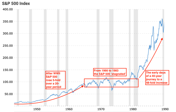
Why revisit market history?
With hindsight, we can see how long-term trends — both positive and negative — evolve and, eventually, exhaust themselves.
These trends — like interest rates falling from 18% to zero — exert influence over market performance.
Producing gains ranging from five to 48-fold through to price stagnation.
When we talk about the ‘market’, it often gets forgotten that we (you, me and millions of other punters out there) are the market. We’re the ones making the choices to buy, sell or hold.
Are those choices always based on sound reasoning and referenced to long-term fundamentals?
To quote Friedrich van Schiller
‘Anyone taken as an individual is tolerably sensible and reasonable — as a member of a crowd, he at once becomes a blockhead.’
When things are booming, temptation can prove to be irresistible…especially the longer the boom lasts. When things are busting, fear takes hold and to hell with ‘shares for the long term’…sell now.
Over the years, there have been numerous studies on ‘funds flow’ into and out of markets.
The data proves conclusively that the majority ‘buy on a (market and emotional) high and sell on a (market and emotional) low’.
Markets are tidal
Money flows in towards the tail-end of boom and flows out during a bust.
The purpose of revisiting market history (since the Second World War) provides context for the following charts.
The chart we’re focused on is the middle one…US Household Stock Allocation (includes Mutual Funds and Pension Funds).
The orange line tracks the percentage allocated to shares by US Households since 1950.
|
|
| Source: CMG Wealth |
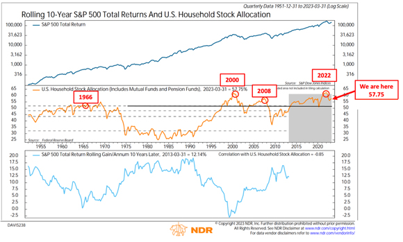
The longer the period of post-Second World War prosperity, the more confident investors became in allocating a higher percentage of their portfolios to shares…topping out around 55% in 1968/69.
By the early 1980s (when the S&P 500 was about to take flight) households had fallen out of love with shares as an investment. Portfolio allocation was down around 25% to 30%…and stayed within that zone until the early 1990s.
Then came a succession of bubbles…Dotcom, US Housing and The Everything Bubble.
Each bubble has tempted investors to adopt an overweight allocation to shares.
When the US Housing Bubble busted, fearful investors (either voluntarily or involuntarily — due to margin calls) reduced portfolio exposure to less than 40%.
In early 2022 (when the S&P 500 peaked around 4,800 points) portfolio allocation to shares was on par with the peak of the Dotcom bubble.
The sell-off in 2022 has slightly reduced the allocation, but not to any meaningful extent.
The current level — 57.5% allocation — slightly above the level reached at the peak of the US Housing Bubble.
The pattern of ‘over and under’ allocation is all-too-familiar and predictable.
Why?
Because, irrespective of the era, humans are the market.
While the 1945 to 1966 boom was modest compared to what we’ve experienced since the early 1980s, we have to remember, at that time, it was quite something.
Here was an asset class that had appreciated 400% over a 20-year period.
You can understand why people were thinking ‘we must have some of that action’.
The same principle applies to each of the last three bubbles.
During the peaking process (which can last longer than you think) more people want a greater slice of the action. It’s basic human nature.
Based on the above chart, it appears that when households allocate greater than 50% to shares, the market is living on borrowed time.
‘What the wise do in the beginning, fools do in the end.’
– Warren Buffett
History clearly shows that reducing exposure to an over-valued markets at a time of your choosing, is the wise choice. Otherwise, after the collapse has happened, we know that people will foolishly sell at a time when the wise will be buying.
Until next week…
Regards,
 |
Vern Gowdie,
Editor, for The Daily Reckoning Australia