
In today’s Money Weekend…a universal pattern…there are two areas outside the range where I search for signs of prices changing direction…the alert I sent out on 30 January before the crash…and more…
In last week’s Trader’s Corner, I dumped a huge amount of information in your lap about the various characteristics of widening distributions.
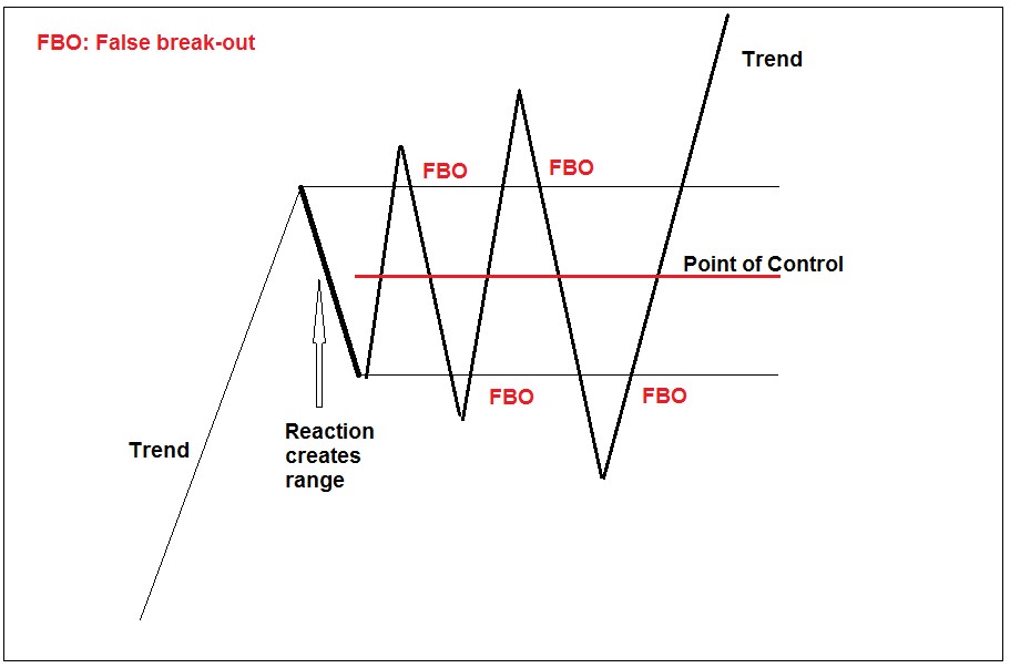
A universal pattern
|
|
| Source: Port Phillip Publishing |
This was the list for people who missed it:
- Amateurs buy in the top half and sell short in the bottom half
- Amateurs are uncomfortable at the Point of Control (POC)
- The market gravitates back to the POC often to shake out traders
- The size of the false break is related to the size of the initial range
- Once prices hit double the size of the range the distribution is over
- The best entry point is 61.8% outside the range against the trend and 25% outside the range is also useful
- Fading the false breaks is a powerful strategy based on risk/reward
- There are areas within the range that often see reversals to the POC. They are known as buy and sell zones and the calculations are 12.5–25% and 75–87.5% retracements of the initial range
- Calculations for buy and sell zones within a range also work for retracement of waves in a trend
- Prices will revisit the POC for one last time before blasting off in a new trend
- You can use the characteristic of mean reversion to lower your average entry price
- After about five false breaks of the range the probabilities increase that a continuation or reversal of the trend is close
This week we are going to zero in on just one of these characteristics, so you can see how powerful it is to understand why these patterns form and how you can take advantage of them.
[conversion type=”in_post”]
In point four above I told you that the size of the false break is related to the size of the initial range.
That’s a pretty useful thing to know. What that means is that you can make calculations based on past data to find points where you have a good chance prices will change direction and head back to the POC.
In point six above I elaborate on point four by saying that there are two areas outside the range where I search for signs of prices changing direction. Those two levels are 25% outside the range and 61.8% outside the range.
Many of you will recognise 61.8% as a Fibonacci level. I won’t go into details about Fibonacci levels. If you are new to trading you can go here to learn a bit about them.
When I tell you that there is a relationship between the size of the false break and the size of the initial range, what I am really saying is that most traders’ stop-losses are within a certain area outside the current range.
Once most of them have gone off, prices look like they are breaking out. But the fact is the gravitational pull of the POC is still present.
When you look at the chart I show you below, consider what the chart looked like at the time when prices were 61.8% above or below the range that I make calculations from.
There aren’t many traders who would be thinking about entering a position against the prevailing short-term trend. The breakout looks like it is confirmed, and prices are trending strongly either up or down.
What I am going to show you with these calculations is that those situations are actually fabulous trading opportunities if you know how to spot them.
The chart I want to show you is the ASX 200 over the last 10 years.
It may look confusing to you, so I want to explain it clearly. I am making calculations based on reactions against the prevailing trend.
The thin black lines are the actual range that calculations are made off. The thick red line is the POC of the range (midpoint) and the blue lines are 61.8% outside the range.
I number each time prices change direction near the area 61.8% outside the range and then return to the POC.
Let’s have a look at the chart…
Making sense of the chaos
|
|
| Source: CQG Integrated Client |
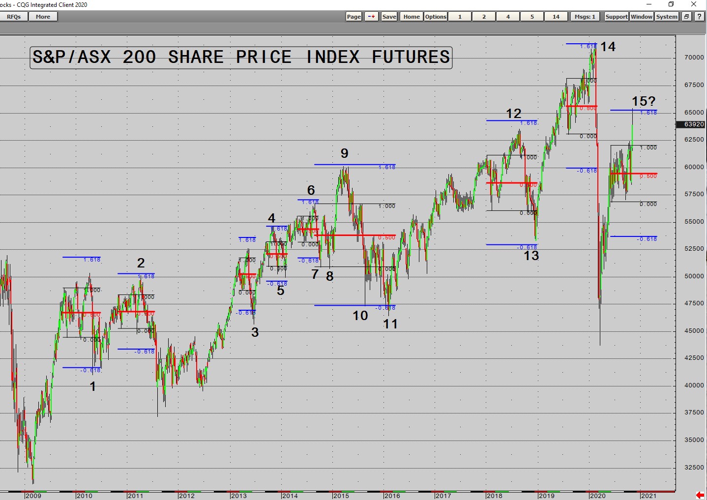
You might need to zoom in on the chart to see a few of them, but if you focus on nine to 14 it should be easier for you to see what is going on.
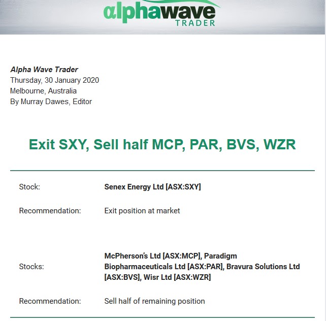
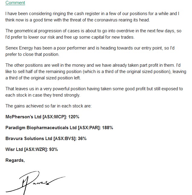
Note that 14 picked the exact high before the crash earlier this year. It was one of the reasons why I sent out an alert to my subscribers to take profits in our biggest winners prior to the crash.
You may have just muttered ‘yeah, sure mate’ under your breath, so here is the alert I sent out on 30 January, weeks before the crash.
My trading service used to be called Alpha Wave Trader, but we’ve since changed the name to Retirement Trader:
|
|
| Source: Port Phillip Publishing |
When you look at number 15 in the chart above, it shows you that prices in the last week have spiked to test the area 61.8% above the range the ASX 200 has been stuck in since June and are selling off again.
It will be interesting for us to watch things unfold over the next few weeks and see whether, once again, the area 61.8% outside a range has picked the high or low exactly.
In today’s article I have focused on just one aspect of widening distributions. There are many more to go and as you learn more about them you will gain an understanding of why most traders lose money.
If you study hard enough you might become one of the traders that actually makes money consistently.
Regards,
 |
Murray Dawes,
For Money Weekend
PS: Our publication Money Morning is a fantastic place to start on your investment journey. We talk about the big trends driving the most innovative stocks on the ASX. Learn all about it here.

Comments