



Yesterday I promised a fleshed-out version of my roadmap.
Here it is.
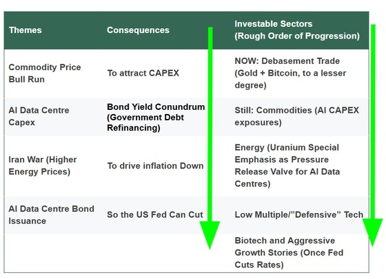
I whipped this up very quickly, and it’s far from a finished product.
Obviously there are some interactions and overlaps and thing could change along the way.
The first column holds the big forces that we, stone cold (Steve Austin), know are shaping our financial world:
- A commodity price bull run
- The AI data centre buildout
- Higher energy prices out of the Iran conflict
- The enormous bond issuance funding all that construction
The middle column is what those forces do.
We know we need mines, the bond market is getting spicy, and all going well, once we get those mines, they should eventually help drag inflation lower so the US Fed can cut.
Governments have to refinance an enormous pile of debt at exactly the moment companies are borrowing hard to build data centres.
Both want the same dosh.
My working assumption is that yields push higher first, and then come down later once supply and slower growth do their work.
Getting the order of those two moves right matters more than getting either one exactly on time.
The right column is where I think money shows up, in rough order.
Gold and Bitcoin now.
Commodities should see a multi-year sustained push, especially anything feeding the AI buildout.
Then energy, with uranium as the pressure release valve for power-hungry data centres.
Then cheap, unloved tech, and then biotech and the aggressive growth stories once cuts actually land.
The green arrows in the chart gesture at this progression.
Right now, the world is screaming about bond yields.
You might yawn at bonds, but when there’s chaos, the manure usually hits the rotating blades:
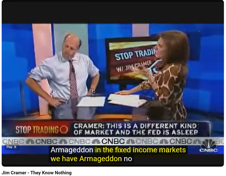
Source: Youtube
Just ask Jim Cramer about bonds and his epic meltdown on live TV when Bear Stearns was selling off.
Tick tock, the market on
two quite similar clocks…
The roadmap for me is based on two different but quite similar clocks.
Both are based on liquidity cycles.
I’m about to share some rather niche and arcane knowledge with you, just to show you a bit of what’s under the hood with the analysis that leads to a stock recommendation in our paid services.
For my services, I like to refer to two things when I want to ask: where are we in the cycle?
The first is Michael Howell’s work at Capital Wars on the global liquidity cycle.
Howell argues that liquidity leads markets, and that the real economy follows along behind it.
He splits the cycle into four moods: rebound, calm, speculation and turbulence.
The full loop runs roughly 60 months:
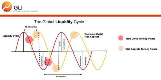
Source: Capital Wars, Global Liquidity Indexes
[Click to open in a new window]
In his July note he had global liquidity peaking in late 2025, with markets sitting in the late speculation phase.
His read is that returns are still on offer in that phase, and that they get more fragile as it wears on.
That’s the fast clock.
And it flows through to just about everything in the machinery of the global financial system.
Then I’ve got my own take on the liquidity stock which is more of a slow clock:
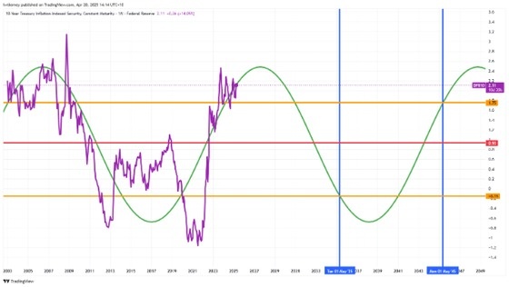
Source: TradingView
[Click to open in a new window]
The US Federal Reserve publishes a data series called DFII10.
It roughly tracks what you actually earn on a 10-year US government bond once inflation takes its cut.
Call it the real return on the world’s safest asset.
It’s one version (in my book) of the mythical risk-free real rate of return.
When it sits low or negative, money often spills out into gold, property, commodities and speculative stocks.
When it climbs, “safe” bonds often do the job on their own and risk assets have to work a lot harder.
Think ultra-boring divvy stocks as well.
So I pulled the series back to 2003 and did three things.
First, I took the average across the whole period. It came in around 0.93%, which is the red line.
Second, I traced the swings above and below that average.
They roll in long waves rather than jumping about at random, and that gives me a really rough green line.
Third, I stretched that wave forward and marked two dates, May 2035 and May 2045.
Where the wave crosses those dates gives me a rough real yield for each.
Around minus 0.15% in 2035, then around 1.75% in 2045.
That’s a hand-drawn shape.
You can call them my special crayon drawings, which forecast the fate of the global financial system for the next 30 years.
Why you should have your
own “crayon drawings”
The point is that you should have at least some grasp of cycles and how they alter prospective investments across asset classes and sectors.
My crayon drawings at least give me some idea of the roadmap that could lead to better exposures across different types of stocks in different global financial circumstances.
That flows through to what types of exposures I seek out, at various given times, based on what I am seeing day to day on the ground, in the charts.
Putting some work into how you see the next 5 years, next 10 years, and next 20 years playing out is always a good exercise.
Learn to be the Tassie property
investor, but in the share market
All this analysis can make you a bit early to things, and you’ve got to know how to wear paper losses and iteratively improve along the way when it stings too much.
Building a view from the macro down means you can arrive before the crowd.
In all honesty, I’ve been early (and as a result, wrong) on a few recommendations this year, and members have worn paper losses, and in some cases, real, crystallised losses.
But in my view, early and right later beats “right” when that’s alongside everyone else.
When the whole market agrees, there’s nobody left to buy from you.
That’s the top, and you should sell.
Maybe your average Aussie property investor will eventually think Tasmania is the place to be?
Who knows, but I like it down here.
Summer temps hit a high of 33 degrees usually…
Tomorrow
I’ll get granular on the debasement trade itself, which was the subject of yesterday’s article.
I’ll attempt to answer the “how long?” question.
Short answer on the timing: it may not have long left as a trade.
Stretch the timeframe out and it could look rock solid as an investment for the next five years.
Short bad, long good. So confusing.
Time is a bloody tricky riddle of a thing.
Warm regards,

Dr. Lachlann Tierney,
Australian Small-Cap Investigator and Fat Tail Microcaps





Comments