In today’s Money Morning…reading the tea leaves…definition of a trend…three decades of BHP…can you find the trades?…and more…
When looking at charts, it can look like a bunch of random squiggly lines to the untrained eye. That’s why there is such a large cohort of people (you?) that scoff at the suggestion that you can glean any information at all from charts.
There is so much terrible technical analysis going on out there that it’s no wonder most people think it is akin to reading tea leaves.
But the goal of reading charts shouldn’t be to predict the future. The goal is to use the charts as a risk management tool.
You can work out where you are proven wrong and where prices should head during periods of mean reversion, which gives you a chance to create no downside positions.
You can use the charts to help you create definite answers to tricky questions. Otherwise, it’s a sea of grey and difficult to make decisions.
What does ‘up’ mean? When have prices changed direction? What is an uptrend? When is the trend over?
You may think the answers to those questions are simple, but the further you go down the rabbit hole trying to find an answer, the more complex it becomes.
Today, I want to discuss one of the methods I use to assess trading opportunities. I’d call it a secondary or tertiary indicator, meaning that it isn’t the key reason why I enter or exit positions.
But it does help in forming a view of where the best opportunities are. If I have a few of my approaches lining up together, my confidence in the trade increases.
We have all heard of moving averages of course. Personally, I don’t rely on any moving average crossover rules at all for my entry points. I think they often lag too far behind the action and have too many false signals.
But I do still find them useful in gauging trends.
Definition of a trend
My method involves adding the one, two, and three standard deviation Bollinger Bands around my longer-term moving average.
For example, on a monthly chart I will use the 10-period exponential moving average (EMA) against the 20-period simple moving average (SMA).
Then I will add the one, two, and three standard deviation Bollinger Bands onto the 20-period SMA.
If the trend is up with the 10-period EMA above the 20-period SMA, then I will see the one and two standard deviation Bollinger Bands below the 20-period SMA as an area of opportunity.
The three standard deviation Bollinger Band below the 20-period SMA is my line in the sand for the trend. If monthly prices close below the highest level of the three standard deviation Bollinger Band, then I will consider the trend as possibly over.
PS: We reveal four little-known small-cap stocks that cannot be ignored…Download your free report now.
Three decades of BHP
Let’s have a look at an example to show you what I mean.
BHP monthly chart
|
|
| Source: CQG Integrated Client |
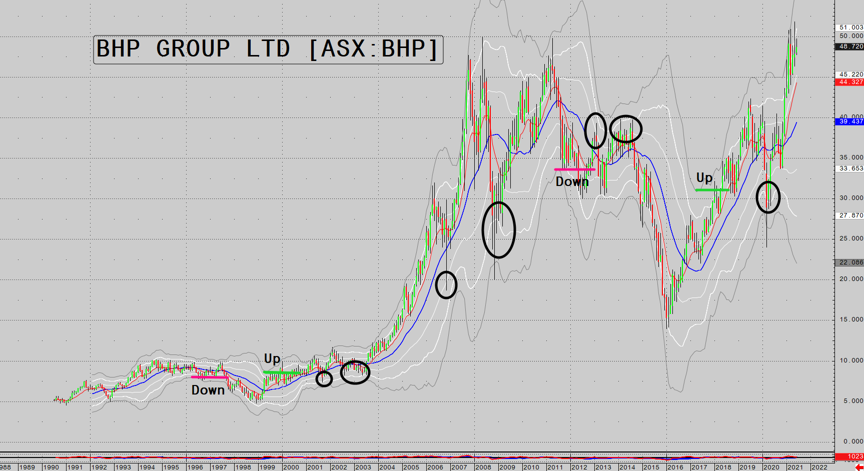
This is a monthly chart of BHP Group Ltd [ASX:BHP] going back to 1990.
The blue line is the 20-month SMA. The white lines are the one and two standard deviation Bollinger Bands, and the grey lines are the three standard deviation Bollinger Bands.
The ‘Down’ and ‘Up’ markers show you when prices closed outside the three standard deviation Bollinger Band according to the rules given to you above.
Once prices are in an uptrend, I see the area one and two standard deviations below the 20-period SMA as spots where I look for reversals in the direction of the uptrend. Conversely, in a downtrend the area one and two standard deviations above the 20-period SMA can create shorting opportunities.
I have circled the areas in the up and downtrends where reversals occurred near the one and two standard deviation Bollinger Bands.
Can you find the trades?
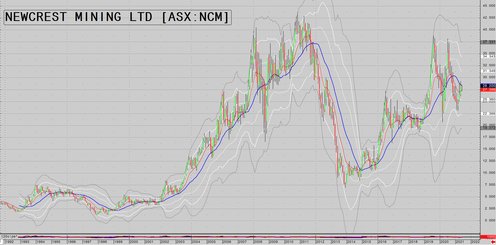
Here is a monthly chart of Newcrest Mining Ltd [ASX:NCM] going back to 1990. Can you spot the shift in trends and the opportunities yourself?
Newcrest Mining monthly chart
|
|
| Source: CQG Integrated Client |
And finally, let’s have a look at a trade we did at Pivot Trader, which is a great case study of using multiple approaches all at once.
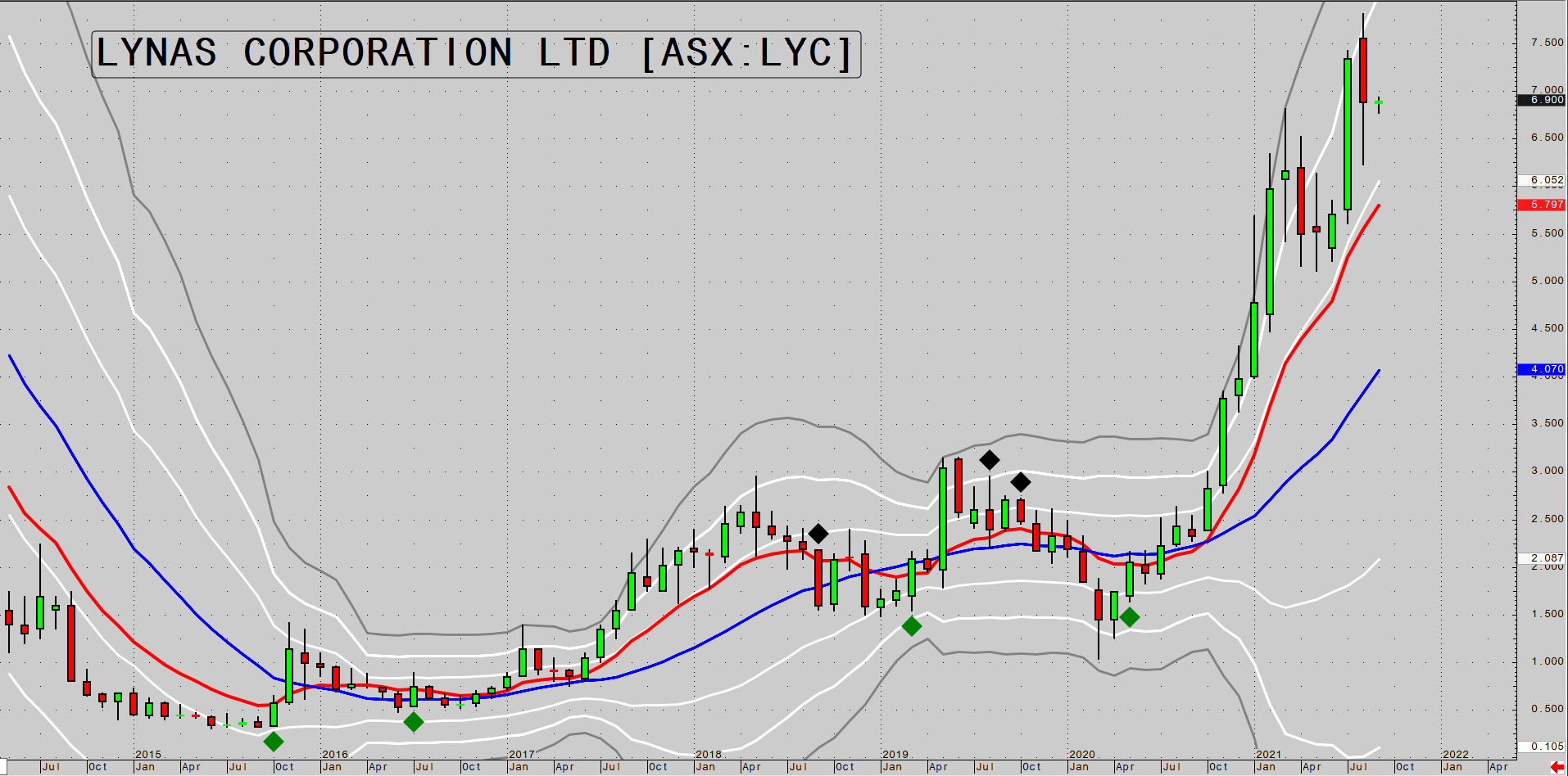
We bought Lynas Rare Earths Ltd [ASX:LYC] at $2.15 in July last year, and it is now trading at $6.89 or 220% above the entry price in just 13 months.
Lynas monthly chart
|
|
| Source: CQG Integrated Client |
With what you have learned today, can you see why I was interested in buying LYC as it started to trend higher from the one to two standard deviation Bollinger Band below the 20-month SMA?
There were other technical reasons for the entry, and it is the combination of various reasons that adds up to a solid trade.
You can see that LYC had just had a false break of the low of the range it was trading in just before we entered the trade.
When a stock is trending up you want to buy the false break of the low of the ranges within the trend.
You can expect to see mean reversion to the point of control of the range, which will give you a chance to derisk and create a no downside position from that point on.
I have described how ranges develop in the past, and you can go through my past articles if you haven’t got a clue what I’m talking about.
Also, notice the monthly buy pivot that was confirmed just prior to our entry into LYC. The monthly buy pivot is confirmed when a monthly close occurs above the high of the lowest price candle in the downtrend.
I liked the fundamental story for LYC, but it wasn’t until I saw all of the above happening that I was willing to pull the trigger.
Hopefully, you can see from what I’ve shown you today that there are technical methods that can help to inform your decision making in a volatile and unpredictable environment.
Regards,
 |
Murray Dawes,
For Money Morning
PS: Click here or on the thumbnail below to watch Lachlann Tierney’s Money Morning Podcast.
In the second week of our gold block, Lachlann talks to Brian Chu of Gold Stock Pro about how ASX-listed gold stocks are shaping up, a potential labour crunch for miners, and what prospective Aussie gold investors can do in this environment.
Subscribe to our YouTube Channel here.


