Some of the factors affecting the US economy were outlined above. Low unemployment, falling inflation, decent GDP (2.4% annualised for the second quarter of 2023) and a surging stock market are certainly enough to cause most investors to sing, ‘Happy Days are Here Again’. What’s not to like?
The answer is a lot. There’s not much comfort to be taken from GDP figures, beginning with the fact that they are backward-looking and have low predictive value. GDP grew 2.4% in the fourth quarter of 2019 before crashing 5% in the first quarter of 2020, then an astounding 31.4% in the second quarter.
Of course, that crash was COVID-related, but that’s the point. There was nothing about 2.4% growth in late 2019 that told you a pandemic was coming, and there’s nothing about 2.4% growth today that tells you what’s coming next. One has to rely on other time series of data.
The same observation can be applied to the current low unemployment rate. The June employment report (most recent available as of this writing) showed job creation of 209,000 jobs for the month of June and an unemployment rate of 3.6%, among the lowest since the 1960s.
|
|
That’s a healthy report on its face, but there are two serious characteristics that need to be taken into account. The first involves what’s known as the labour force participation rate (LFPR). This counts all of the working-age population of the US who have jobs as a percentage of the total working-age population.
That’s different from the unemployment rate because to be counted as ‘unemployed’, you must be looking for a job. There are tens of millions of working-age Americans who do not have jobs but are not looking for one. They are not counted as unemployed, but they do show up in the LFPR calculations.
Right now, the LFPR is 62.6%. That’s the same level the US first reached in November 1977, when women were entering the workforce in large numbers. It’s significantly below the 67.2% level reached in January 2001, when baby boomers were in the prime of their careers.
This number never gets close to 100%; in fact, a 70% reading is quite high. There are many reasons for Americans not to be in the labour force, including students, homemakers, those recovering from an illness, and others.
Still, the drop from 67% to 63% means 4% of a total workforce of 167 million citizens or 6.7 million workers have simply dropped out of seeking work relative to 2001.
If those 6.7 million workers were added to the number of unemployed today, the national unemployment rate would be 7.6%, a rate more closely associated with a recession. In effect, the low participation rate is hiding a large unemployed cohort not being counted by the government in the official employment report.
Driving a car by looking in the rearview mirror
The second and even more critical defect in using employment statistics in economic forecasting is that employment reports are lagging indicators, not leading indicators. When the economy begins to slow down, businesses will do everything except lay off workers to keep the doors open.
They will cut inventories, lower prices, seek rent reductions, cut administrative costs, and a lot else before they fire valuable workers. All of those strategies are clear signs of a failing economy, but they do not show up in the employment reports.
By the time employers get around to firing workers, it’s too late for the economy. It’s bad for workers and quickly makes the recession far worse, but the damage is already done. Don’t rely on low unemployment rates to conclude all is well. The opposite could easily be true.
Still, there are powerful indicators suggesting the US economy is in or near a severe recession, in addition to better-known measures such as the unemployment rate. These indicators are technical and require some explanation but are important to investors.
Dead bugs on the windscreen
The first leading indicator is an inverted yield curve. A yield curve shows interest rates on securities of different maturities from one issuer, or it can show interest rates on a single instrument at different points in the future.
In either case, the curve is normally upward-sloping (longer maturities or later settlement dates have higher interest rates).
That makes sense. If you’re lending money for longer, or betting on rates further into the future, you want a higher interest rate to compensate you for the added risk from events such as inflation, credit downgrades, bankruptcy, and more.
Incidentally, the recent downgrade of the credit rating of the United States from AAA to AA+ by Fitch Ratings is nothing to cheer about. It is not likely to have much impact on the markets in the short run, but it’s certainly another straw in the wind showing that the US is on a non-sustainable fiscal course that can only end in default, hyperinflation, or protracted depression-level growth.
On rare occasions, yield curves become inverted. That means longer maturities (or later settlement dates) have lower interest rates, not higher. This sends a powerful message. It says that investors expect a recession or severe slowdown in growth.
The recession will be so strong that it will cause interest rates to drop sharply in the near future. The effect of the economic slowdown risk is greater than the influence of the other market risks previously described.
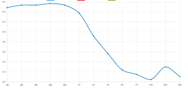
The inverted yield curve today:
|
|
| Source: Statista |
Yield curves in US Treasury securities are steeply inverted today. So are yield curves in SOFR (formerly eurodollar) futures contracts. These are no casual signals. The last time both yield curves were this steeply inverted was prior to the global financial crisis of 2008.
If you’re not factoring this signal into your forecast, you’re missing a five-alarm fire. The system is flashing red.
The imbalance sheet
Another technical yet powerful signal is a condition known as negative swap spreads. A swap is a simple contract between two parties in which one party agrees to pay a floating rate, and the other party pays a fixed rate based on a specified amount called the ‘notional’ amount.
It’s the synthetic equivalent of buying a bond (say, a 10-year Treasury note) and financing it in the overnight repo market. The buyer receives fixed interest (on the bond) and pays floating interest (on the repo).
So, a swap is a leveraged bond position — without the bond!
Negative swap rates arise when the fixed rate paid on the swap is lower than the fixed rate paid on an equivalent maturity Treasury note.
Swaps make sense (they’re off-balance sheet and use up less regulatory capital), but why would you accept a lower rate from a bank dealer counterparty than you could get by owning an equivalent maturity Treasury note?
The answer is the one just mentioned — they’re off-balance sheet. Counterparties will take a lower yield to do the trade-off balance sheet (the swap) than on balance sheet (the Treasury note).
This means that bank balance sheets are contracting. Balance sheet capacity is strained. That’s another early warning of a credit crunch that presages a recession.
There are many other such signs. They’re all technical, and we don’t have the space here to describe them all. It’s enough to say that all of the technical signs are unusual, and all point in the direction of a recession. They all have good track records of predicting recessions going back to the 1970s and earlier, depending on the time series.
In the US, the fundamentals (industrial output, global trade, inventory accumulation, credit, commercial real estate) are negative. The technicals (yield curves, swap spreads, bank equity) are negative. The only positives are unemployment (a lagging indicator) and the stock market (a cap-weighted bubble).
Unfortunately for investors, stocks and jobs are the only things the financial TV talking heads talk about. Don’t fall for it.
All the best,
 |
Jim Rickards,
Strategist, The Daily Reckoning Australia


