I don’t think I’ve ever come up with a single good investment idea from watching or reading the news.
Don’t get me wrong, I have nothing against journalists who work for these organisations.
You just have to remember that they are only journalists.
They make money from writing in an engaging and informative way — not from being good at investing.
Too many people forget that.
I think a lot of people, especially of my parent’s generation, grew up treating ‘the news’ as some special arbiter of wisdom and truth.
I don’t think that’s true today…if it ever was.
Today, most news is noise put out by people who know just enough to sound like they know a lot more than you do.
Even worse…
Sadly, a lot of news is thinly disguised propaganda pushing whatever ideological barrow they support.
It’s hard for the average person to know what’s really going on. And without knowing that, it makes it hard to invest wisely.
I suppose that’s part of the Money Morning mission.
To cut through the noise and provide some genuine insight that you can use in your own investing decisions.
In my experience, there are two distinct ways you can do this…
Reading the tea leaves
The first is deep, independent research.
I’m talking about getting hold of the raw data, scanning balance sheets, cash flow statements, running models, cross-checking forecasts, and building your expertise.
This is time-consuming, sure.
The realisation that you know more than the ‘news’ can be very satisfying, and you can use this ‘edge’ to find underpriced opportunities.
The second way to find good investment ideas is a bit of a cheat, but it can certainly help you work out where to focus your time and money.
And in my career, I’ve found it a great starting point.
I’m talking about charting…or technical analysis, as it’s known.
Charting has many sceptics in the ‘serious’ investing community. They say it’s no better than reading tea leaves!
But, to my mind, what charting allows you to do is two things.
First, it allows you to clearly see if money is moving into or out of a sector or company.
Second, it allows you to gauge the underlying psychology of the current holders.
What do I mean by that?
Well, imagine a stock is 50% down from its high. You could guess a little bit of panic would’ve set in.
Now imagine a ‘bad story’ came out about the company. Or maybe the market just had a big down day.
If the price doesn’t react much, you can guess that the current shareholders are holding fairly strongly.
That can be a good opportunity for you to join them.
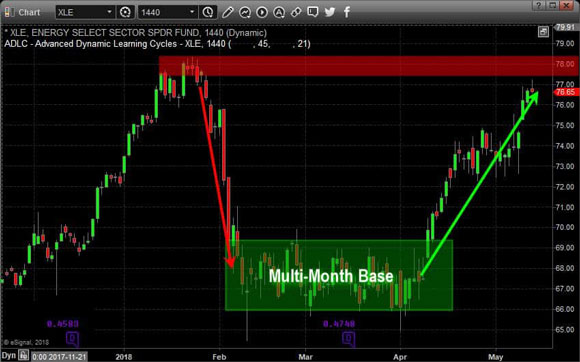
Even without any news, a period of sideways price movement — known as a basing phase — can be a good signal a price bottom is in.
Check out this example:
|
|
| Source: The Technical Traders |
This energy sector ETF declined rapidly before spending three months in a basing phase and eventually breaking higher.
I should point out I’m not a pure technical trader because I like to invest in good ideas rather than patterns on a screen.
I mainly use charts as a starting point for further investigation.
Here’s how…
Three examples today
My personal investing focus is on high-growth sectors with exponential potential.
Things like small-cap stocks in industries like technology, biotech, and mining.
I’m basically looking for asymmetric returns — the potential to make much more on the upside than on the downside.
Which brings me to my first chart:
|
|
| Source: Incredible Charts |
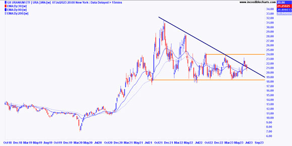
This is the chart of Global X Uranium ETF [URA].
It’s an ETF investing in a basket of stocks in the nuclear energy industry.
I’ve seen a bit of chatter from some energy experts lately, suggesting that many countries are turning back to the nuclear option.
For example, Sweden recently announced it was keeping nuclear plants going, reversing a decision 40 years ago to phase the technology out.
Anyway, it’s definitely an area worth diving into.
But what does the chart say?
Well, as you can see, it’s still in a bit of a downtrend, but there are also signs that we’re in a sideways phase too.
If we get a break above that $24 level, it could be game on for the sector.
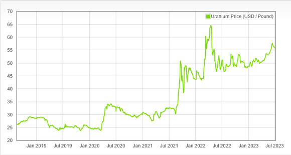
The uranium price looks fairly strong right now as well:
|
|
| Source: Daily Metal Price |
For me, this all means keeping an eye on and setting alerts on uranium stocks on the ASX, like Paladin Energy [ASX:PDN].
This next chart is interesting…
|
|
| Source: Incredible Charts |
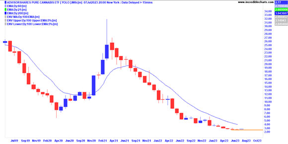
This nightmare of a chart is the AdvisorShares Pure Cannabis ETF [YOLO].
I love that ticker!
But as you can see, YOLO-ing (millennial slang for ‘you only live once’) into speculative sectors like cannabis isn’t for the fainthearted.
Cannabis has had two decent bull runs in the past six years.
First in 2017 and then in early 2021.
Both bull runs coincided with election cycles in the US that promised more deregulation.
But as you can see, it hasn’t translated into sustainable profits for investors, and the ETF has plummeted by more than 90% from the 2021 highs.
However, though it’s early, we’re seeing signs of a bottom forming at these levels.
For me, this is a signal to take another look at this beaten-down sector.
While I don’t expect it to turn around any time soon, in the depths of such charts can lie extreme hidden value — as long as the original idea had merit.
I remember seeing much the same in the lithium sector back in 2015, and that has turned into a monster industry since…
One last chart:
|
|
| Source: Incredible Charts |
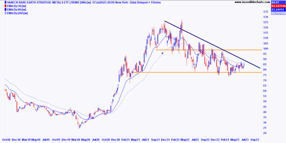
This is the chart of Van Eck Rare Earth/Strategic Metals ETF [REMX].
I looked at this chart because there was a story in the news yesterday about how China was about to block exports of two critical rare earth minerals.
Namely, gallium and germanium.
The story breathlessly declared this could be a boon for Aussie rare earth miners.
It’s not an unreasonable assumption (though similar China ‘rare earths ban’ stories have played out many times over the past few years). However, as I said at the start, I’ve never made money from reading such ideas in the mainstream press.
But I checked the chart anyway.
What does it say?
Well, to me, this is a fairly weak chart right now.
I see lower highs, and slightly lower lows, though it is holding onto a strong support line at around $77…just!
We’ll see if this latest ‘big news’ moves the needle on rare earths stocks. But if it doesn’t, the psychological clue is that there are few new buyers.
And that means a big risk it loses support at $77.
Of course, that doesn’t mean it will happen.
But for me, I don’t see any reason to pay more attention here until we at least see a break of that downtrend from early 2022.
The more you look at charts like this, the quicker you see signals that interest you.
It’s not a perfect science, but as a starting point for deciding where to devote your energies, it works pretty well for me.
And it’s certainly better than watching the news!
Good investing,
 |
Ryan Dinse,
Editor, Money Morning

