
In today’s Money Morning…are these charts messing with your mind?…we’re nowhere near all-time highs yet…a silent crash in cash…and more…
‘We see things the way our minds have instructed our eyes to see.’
Muhammad Yunus
Let’s start today’s piece with a strange image.
Look here:
|
|
| Source: Dr Julie Smith |

Even though the image is upside down, you can still make out what the picture is.
Or can you?
Let me show you what the picture really looks like when you turn it around…
Check out the image when it is turned around:
|
|
| Source: Dr Julie Smith |

Pretty crazy, eh?
If you don’t believe it, turn around your laptop or phone and you’ll see this is what the first image shows.
Our brain basically takes the first image and adjusts it for what we expect to see, not what is really there.
This is a phenomenon psychologist Peter Thompson coined ‘The Thatcher Effect’ after the late British PM, Margaret Thatcher, on whom he first demonstrated it in 1980.
The lesson?
You’re not always seeing what you think you are…
Are these charts messing with your mind?
There’s a popular narrative out there right now that this bull market has ran too long and we’re due for a big crash.
There are a few theories for this supposed crash, but most of it is based in some way on the simple fact major indices are at or near record highs.
The Dow Jones Index closed last week at a record high, the S&P 500 hit new highs before retreating on Friday, and the tech-focused Nasdaq Index is still hovering close to new highs after a strong October.
Here in Australia, our main economic benchmark — the All Ordinaries Index of top 500 companies by valuation — is only 2.28% away from all-time highs too.
It would appear we’re in the midst of a raging bull market.
But the bears see this as a euphoric, late-stage bubble. The kind of blow-off top you usually see before a crash.
When you look at a chart like this one of the Nasdaq, you almost can’t blame them:
|
|
| Source: Incredible Charts |

It’s almost going vertical!
You could do this with many charts right now from large-cap stocks to commodities, through to property prices.
Many investors see this and think, ‘This is crazy, markets must fall back down.’
But like the Thatcher effect from before, I think their brains are fooling them in a very strange way.
You see, I think they’re missing a crucial part of the picture.
And if I’m right, then we’re already in the midst of an almighty crash — just not the one they expected.
Let me show you what I mean…
We’re nowhere near all-time highs yet
Let’s start with a different way of seeing that Nasdaq chart from before:
|
|
| Source: Preston Pysh |

In this chart, the Nasdaq is still 30% down from the 2000 dotcom highs.
How?
Well, this chart is adjusted for the increase in money supply (M2) created by loose central bank policies.
Similarly, the S&P 500 chart below still hasn’t caught up with where it was before the COVID crisis.
|
|
| Source: Skoll and Hati |

The green line here shows the value of the oft-quoted index when you adjust it for money supply (M2). The orange line is the normal nominal value.
It’s not that hard to understand what you’re seeing here.
Basically, all that money sloshing around has found its way into stocks and property, increasing the nominal value.
But when you divide the index by the amount of money created, proportionally, less has gone into the market than at other times.
Thought about another way, total money supply is underweight stocks compared to times past!
But what’s really happening is something even simpler to understand. And a final chart will show you my solution…
How to Limit Your Risks While Trading Volatile Stocks. Learn more.
A silent crash in cash
What you’re actually seeing in every ‘melt-up’ chart is really the value of cash crashing!
This is no big surprise to most wage earners who’ve seen the price of everything from used cars to food, to property, go up over the past couple of years.
Or for citizens in Turkey, Argentina, and Venezuela — who have seen the price of everything soar as their currencies become worthless.
This has all coincided with huge injections of money into the economy by central banks, including the US:
|
|
| Source: Federal Reserve |

Along with low and even negative interest rates in some countries, these policies have resulted in the value of money falling significantly.
Why hold something that earns no interest?
Why hold an asset that can seemingly be created at will?
These policies were meant to be temporary, but in my opinion, there’s no going back now. To do so in any meaningful way would crash asset values.
And a huge market crash would disenfranchise the huge baby boomer generation who are either in or approaching retirement.
It would devastate them financially more than any other group.
And politically, they’re still one of the most important voting blocs in Western democracies. Which means self-interested politicians will sacrifice anything to keep them happy.
So instead, markets will be propped up and we’ll have this silent crash in cash instead.
The bears won’t believe it as markets continue to rise and the exponential charts move to new extremes.
That doesn’t mean there won’t be volatility and corrections. Of course, there will.
But a GFC, Armageddon-style crash?
I’m not buying it…
Every crisis from the GFC through to COVID has shown the policy response from central banks will always be swift.
Print more money!
Now, the death of cash opens up one opportunity bigger than the rest.
This tweet shows you where to look:
|
|
| Source: Twitter |
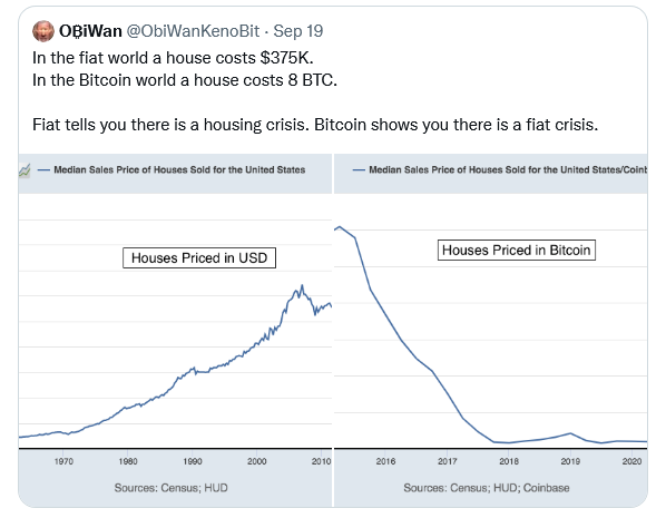
Priced in Bitcoin [BTC] — instead of dollars — everything has been going down in value for the past 10 years, not up.
Some big ideas to consider to finish…
In my opinion, if the central banks keep printing money, markets will run harder than most imagine.
And, eventually, bitcoin will become the next global reserve currency…
Good investing,
 |
Ryan Dinse,
Editor, Money Morning
PS: Our publication Money Morning is a fantastic place to start on your investment journey. We talk about the big trends driving the most innovative stocks on the ASX. Learn all about it here
