
You’re not dreaming.
The market has been on an absolute tear of late.
But there’s a gripe I can’t let go of, and it goes beyond just the shrinkflation we’re seeing on supermarket shelves…
It’s about the measure of everything — everything with a dollar value attached to it.
Including both packets of chips and the entire stock market.
Here’s the first point in my Martin Luther-esque ‘95 theses’ I want to nail to the door of financial commentary.
‘All Time Highs’ are meaningless.
They represent the ultimate smokescreen in financial markets today.
Every time markets hit fresh ‘record levels,’ financial media erupts with excitement about historic achievements.
The S&P 500 reached 6,764 points in October 2025, with many commentators breathlessly declaring these unprecedented heights.
Australian markets followed suit, with the ASX 200 hitting an all-time high of 9,054 in August 2025.
But here’s the real point about ‘real’ money.
These records exist purely on a nominal basis, ignoring the fundamental reality of monetary debasement over recent decades.
Since 1957, the S&P 500 has delivered average annual returns of 10.54%, but when adjusted for inflation, real returns drop to just 6.68%.
The difference between these figures reveals the magnitude of the monetary illusion.
This is M2 Money Supply in the US over the last 5 years:
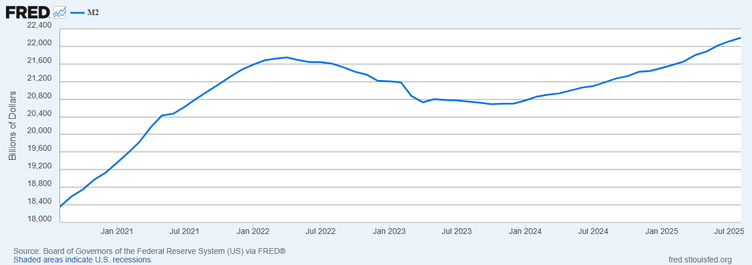
Source: US Federal Reserve (FRED)
M2 is a measure of the money supply. It includes cash and checking deposits (M1), plus savings deposits, small time deposits, and retail money market mutual fund shares.
In my eyes, that’s a rough measure of US money that’s available to be pushed into the market.
From 2020 to 2022, the Federal Reserve expanded M2 from approximately US$15.3 trillion to over US$22 trillion — a staggering 44% increase in just two years.
By August 2025, M2 reached US$22.2 trillion, representing sustained monetary expansion that fundamentally altered purchasing power.
I’ll be firm on this….when stock prices rise alongside massive money creation, calling these moves ‘all-time highs’ becomes intellectually dishonest.
The dollar measuring these gains has been systematically debased.
No wonder people are lining up around the corner in Sydney to buy gold:

Source: James Woodburn
(By the way, just wait until the debasement trade properly hits Bitcoin.)
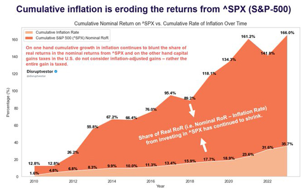
Inflation-adjusted analysis reveals how misleading nominal narratives have become.
Between 2021 and 2025, a $100 S&P 500 investment grew to $180.45 nominally but delivered only $50.92 in real purchasing power terms — a dramatic difference highlighting the monetary mirage.
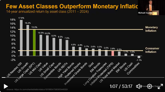
Source: Michael Saylor
The period from 2020 to 2023 particularly demonstrates this phenomenon.
While markets celebrated ‘recovery’ and new highs, real returns (after adjusting for inflation and money supply growth) painted a completely different picture.
And then there’s this analysis, which my old mentor Ryan Dinse pointed out astutely last year:
Source: Market Watch
Michael Saylor’s analysis presented at the H.C. Wainwright Conference showed that since 2011, only large tech stocks, high growth stocks, and large-cap US stocks managed to keep pace with monetary inflation.
Every other asset class went backwards when measured against this more accurate benchmark.
No wonder people are loaded up to the gills with these stocks right now.
They don’t have a choice.
The run should continue then, but what are the cycles telling us about how long it will last?
Cycles point to more room to run, and remember, the taps aren’t even on yet.
Whether you like W.D. Gann or more modern cycle theorists, there should be more room for this bull run to continue.
The monetary faucet, or more accurately, firehose, hasn’t even been plugged into the fire hydrant yet.
The 18.6-year property and investment cycle suggests we’re approaching a peak around 2026, followed by a correction through approximately 2030.
This, combined with Cross Border Capital’s Michael Howell’s research on 65-month liquidity cycles, points toward continued market strength through late 2026.
And then there’s the simple monetary policy reality: plenty of ammo, no rate cuts yet.
The Fed is well and truly boxed in right now.
With trillions in debt rolling over between 2025–2027, monetary authorities face sustained pressure to maintain accommodative policies.
This creates conditions where nominal ‘all-time highs’ become increasingly inevitable, even as real purchasing power considerations suggest more modest actual gains.
The bull run will continue because the measuring stick itself keeps shrinking.
Regards,

Lachlann Tierney,
Australian Small-Cap Investigator and Fat Tail Micro-Caps
***
Murray’s Chart of the Day – US 2-Year Bond Yields
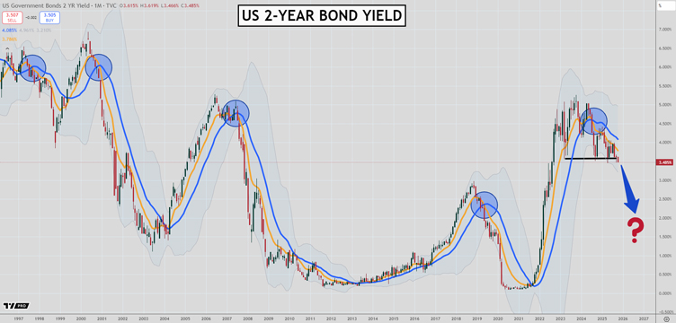
Source: TradingView
Conditions are ripe for a sharp drop in US 2-year bond yields.
The chart above shows you how impressive the monthly moving averages have been at picking out long-term trends in interest rates.
The blue circles show you each time in the last 25 years the 10-month EMA crossed below the 20-month SMA, signalling a long-term downtrend had begun.
If you bought 2-year bonds as soon as that signal pinged and then held them until the long-term trend changed you would have done very well.
In the last instance which occurred mid-2024, yields fell 1% from 4.50% to 3.50% in a few months. Since then they have been treading water as the market grappled with the path of inflation and the economy.
3.50% has provided major support since late last year with yields bouncing off that level and rising three times.
That has set up conditions that could see rates fall sharply if the 3.50% level gives way.
Oil prices are looking shaky as I have been saying for a while, and there is a chance we see a surprising swan-dive in them over the next few months.
Perhaps the economy is weaker than people realise.
Or there is concern about what comes next in the US-China trade spat.
Either way, the charts are pointing to another period of falling interest rates, so locking in high dividends or term deposits prior to the fall may be the way to go.
Regards,

Murray Dawes,
Retirement Trader and International Stock Trader

Comments